

When it comes to publishing your book, one truth stands above all: your cover is your first impression. A beautifully written novel, a transformative memoir, or an insightful self-help guide can easily be overlooked if the cover doesn’t grab the reader’s attention. This article, adapted from our recent webinar hosted in partnership with BookLife and Publishers Weekly, explores how typography, image selection, and genre alignment can turn your cover from good to irresistible.
Designing to sell: The cover as a product
As authors, you’re emotionally tied to your stories — you know your characters inside and out, your plot twists, your emotional beats. That connection often leads to a cover design focused on summarizing the narrative. But a professional designer sees a book cover as a marketing tool, not just a visual summary.
Your designer’s mission is to translate your story’s essence into something that resonates at a glance with your target reader, whether on a bookstore shelf or a thumbnail on Amazon. It’s not just about what’s beautiful — it’s about what’s effective.
Typography: Crafting a visual voice
Typography is about more than just choosing a font. It’s how you guide a reader’s eyes, establish tone, and convey your genre — all in a matter of seconds.
Key principles of typography:
- Genre awareness: Fonts should align with your genre. Romance novels often use flowing scripts; thrillers go bold and minimal; children’s books use clear, simple fonts.
- Audience readability: Choose typefaces appropriate to your readers’ needs. Children’s books need easy-to-read fonts. Adult fiction offers more leeway for stylistic flair.
- Hierarchy: Your cover should have a clear text hierarchy. What should a reader notice first? The title? The hook? Arrange the font size, weight, and color to guide the eye naturally.
- Thumbnail legibility: Always test how your cover looks when reduced to thumbnail size. If your title disappears at small scale, your sales might too.
Example 1: Middle Grade Fiction

In this cover, the title was nearly illegible. By zooming in, using a contrasting gold color, and creating visual depth by layering hats around the title, we instantly improved both readability and engagement. Strategic placement of the subtitle helped fill the visual “dead space” in the center — a known focal point in visual design.
Image choice: Evoking the right emotion
The right image does more than decorate — it communicates. It sets the emotional tone, defines genre, and creates a lasting impression.
Things to consider:
- Mood: Is your book dark and mysterious? Light and whimsical? Choose images that reflect that.
- Genre norms: Sci-fi and fantasy often feature dramatic, magical, or dystopian scenes. Memoirs tend to use personal or evocative photography. Self-help leans towards bright, hopeful visuals.
- Cropping & composition: Avoid awkward crops (e.g., cutting off limbs at joints), and center your focal points unless intentional asymmetry is part of your design.
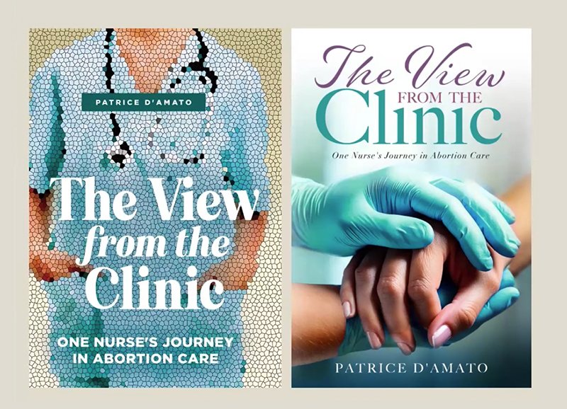
Example 2: Memoir

Originally, the cover featured a mosaic texture and a cropped image of a medical professional. This could be misleading since the book is not a medical textbook. Instead, a new image of comforting hands — one gloved, one bare — instantly conveyed empathy and care. A handwritten-style script font reinforced the personal, heartfelt tone.

Genre alignment: Speak the language of your readers
Want to stand out? First, make sure you belong. Readers often scroll or browse quickly, looking for books that feel familiar in tone, color, and style to what they already enjoy. That’s why genre research is critical before finalizing your design.
Quick Tips:
- Browse top-selling books in your genre on Amazon or Barnes & Noble.
- Identify recurring visual themes — bold titles, moody colors, character-centric imagery.
- Note font types, color palettes, and use of symbols.
Example 3: YA sci-fi fantasy

The original design leaned heavily on a symbolic icon with soft tones, which didn’t align with YA sci-fi’s bold aesthetic. Featuring a protagonist on the cover is a popular trend for the YA genre. By introducing a silhouette of the female protagonist, a color scheme rich in cinematic blues and oranges, and a neo-futuristic font, we captured the “rebellion and revelation” mood typical in the genre. We even subtly integrated the symbol by using it in the typography itself — replacing the “A” with the emblem.
Contemporary design for contemporary audiences
Self-help is one of the fastest-growing book genres, especially with readers aged 25–40. That means your cover must not only inspire — it must appeal to modern sensibilities.
Example 4: Personal development book

Originally using a dark color palette and an overused upward arrow, this cover lacked the inspirational vibe that the genre demands. The redesign features bright, uplifting colors and trendy, illustrated characters climbing ladders and “building” the book title — mirroring the journey of personal improvement the book promises.
Large, bold all-caps type and a contemporary design immediately made the book feel relevant, encouraging, and dynamic. Splitting the cover visually also hinted at transformation: from stuck to empowered.
Back covers, spines, and series consistency

While the front sells the book, the back cover closes the deal — especially for print editions. Pull quotes, impactful taglines, and highlighted hooks can guide a buyer from interest to purchase.
- Spines should be simple, readable, and consistent with the cover design. Avoid crowding.
- Series design should incorporate unifying visual elements — whether it’s a font, symbol, color scheme, or layout style. Give your designer a heads up if you’re planning sequels!

Special cases: Children’s books, memoirs, and coffee table books
- Children’s books (ages 3–7): Prioritize clarity and simplicity. Bright colors, large fonts, and minimal overlap between text and illustrations are key. If it’s a read-aloud book, ensure the font is visible from a distance.
- Memoirs: Choose an image that reflects the emotional core of the story. This could be a childhood photo, a location, or a symbolic item tied to a turning point in the narrative.
- Photography & art books: Let the art speak. Keep text minimal, focus on clean design, and consider including a short artist’s statement or concept blurb on the back.
Tools & resources
- Design software: Adobe Creative Suite remains the gold standard. While tools like Canva are accessible, their templates can limit creativity and result in generic designs.
- Font identification: Use WhatTheFont or the Adobe Fonts search feature to identify fonts you admire.
- Color psychology: Research how colors influence emotion and genre perception. Purple evokes empathy; red signals urgency; yellow radiates optimism.
Final thoughts: Design with intention
Your book cover isn’t just decoration. It’s a handshake, a billboard, and a sales pitch all in one. A thoughtful, genre-aware design doesn’t just look good — it speaks directly to your ideal reader and increases your chances of success.
Take the time your book deserves. You’ve poured your heart into the manuscript and shouldn’t rush the final step. Whether you’re working with a designer or doing it yourself, make choices that reflect the story you’re telling and the readers you’re trying to reach.
Need help? Our team at BookBaby is here to bring your vision to life. Whether it’s a custom cover design, typography guidance, or series branding, we’ve got your back.
Watch our book cover design webinar


